Apple Music Let A Song Draw Its New Logo
Apple Music launched its first rebrand since 2015, a black and white identity shaped by a piece of music and filmed in a pool of mineral oil. The same music is now the brand’s sound. It is a lesson in building a brand from something real.
Apple Music launched its first rebrand since 2015, a black and white identity shaped by a piece of music and filmed in a pool of mineral oil. The same music is now the brand’s sound. It is a lesson in building a brand from something real.
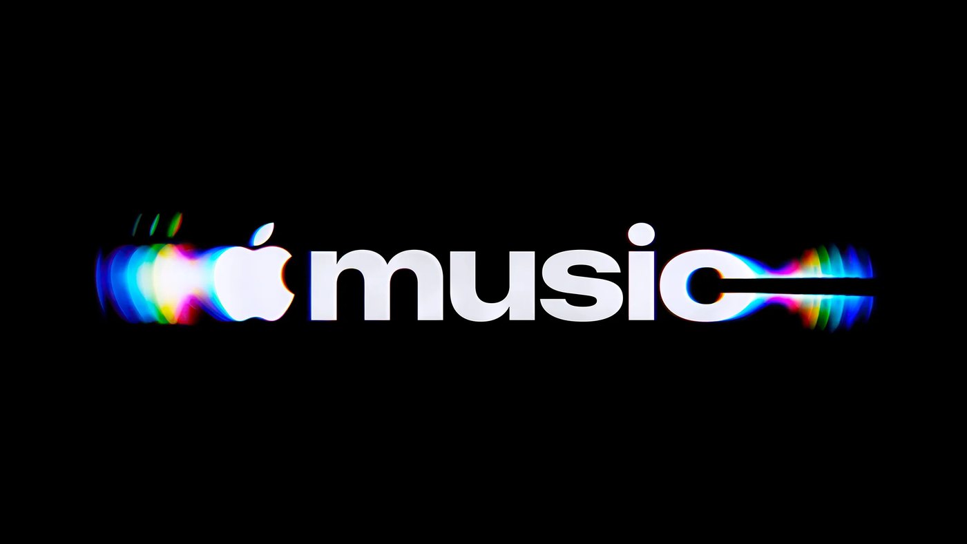
For its first new look since 2015, Apple let a piece of music draw the logo
Apple Music launched a new identity on October 21, its first rebrand since the service started in 2015. The old icon was a white note on a red background. The new one is black and white, and Apple says it was “made by sound.”
The musician Fred again.. and NEST Acoustics wrote an original composition and split it into individual notes. Each note was played through a transducer sitting in a shallow pool of mineral oil, which turned the sound into vibrations. The team filmed the ripples, and the footage became the shape of the new note. Apple says it was captured entirely in camera rather than drawn on a computer.
The same piece of music is now Apple Music's sonic signature, so the brand sounds the way it looks. The wordmark pairs the Apple symbol with a custom bold version of SF Pro, set in lowercase. The new design reaches iPhones with iOS 27.2.
Why Apple Did It This Way
The work was led by TBWA\Media Arts Lab, Apple's long time agency, and it reversed the usual order. Most brands design a logo first and add a sound later. Here, the sound came first and the picture followed.
It took months. The team had to tune the music and the image together, because too many notes, or notes pitched too high, made the oil move so much that the shape stopped reading as a note. The final mark is described as a physical record of music, not a picture of what sound might look like.
There is a reason a company with Apple's resources would go to that trouble. Anyone can now generate a slick image in seconds. A logo made from a real event, by real people, with a film to prove it, carries a story that cannot be copied. Apple did something similar with Apple TV last fall, when it dropped the plus from the name and introduced a new look with a sound written by Finneas.
The Risk In Changing A Color
Not everyone is convinced. Early reaction has been mixed, and some longtime users say they miss the red. That is the cost of any rebrand that touches a color people see every day: the old version becomes familiar, and familiarity feels like quality.
Apple is betting that the story will outlast the complaints. The new identity was first seen in September on the wall of Apple Music Hall, a new live venue in London, before it ever appeared on a phone. By the time most people update their software, they will have met it in a room full of music first.
What It Means For Brands
The lesson for smaller companies is not to film mineral oil. It is that the strongest identities now start with something true about the business, made in a way that can be shown. A restaurant can build its look from its own kitchen. A studio can build it from its own sound. The making of the brand becomes part of the brand.
Sound deserves more attention than it gets. Most companies spend months on a logo and minutes on what customers hear: the hold music, the notification, the song in the store. Apple just spent months on both, and made them the same thing.
Finally, a brand can change its color and keep its meaning, as long as the reason is clear. Apple Music let go of the red because the new idea was stronger than the old habit. For any business planning a refresh, that is the test worth applying first.
Privacy Preference Center
When you visit a website, it may store or retrieve information in your browser, usually in the form of cookies. This site keeps that to a minimum: we use only the technologies needed for it to work properly, and we do not use advertising, analytics or tracking cookies. You can learn more in our Cookie Notice.
Thank you. You are on the list.