McLaren Found Its New Logo on a Garage Sign
McLaren's new wordmark was not drawn from a blank page. It was lifted off the painted sign above the Auckland garage Bruce McLaren's parents ran, and it lands while half the market is still sanding its history off to look like an app. The oldest asset turned out to be the newest idea.
McLaren's new wordmark was not drawn from a blank page. It was lifted off the painted sign above the Auckland garage Bruce McLaren's parents ran, and it lands while half the market is still sanding its history off to look like an app. The oldest asset turned out to be the newest idea.
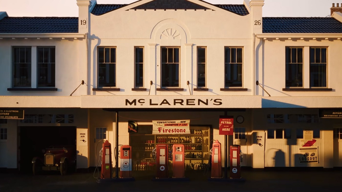
McLaren changed its logo last week, and the new one is older than the company
The wordmark McLaren revealed ahead of the Azerbaijan Grand Prix was not invented by a studio. It was traced from the hand painted sign above a service station on Remuera Road in Auckland, the one run by Bruce McLaren's parents, Les and Ruth. Bruce rebuilt a 1929 Austin 7 Ulster in that workshop at fourteen and won his class at the Muriwai hillclimb a year later. The racing team, the road cars and everything with papaya on it started under that sign.
The change is small on purpose. The letters now carry the sign's proportions, the little c sits raised with a line beneath it the way it did above the pumps, and a custom typeface called McLaren Sans runs the rest of the system. The speedmark, the swoosh drawn from a rear wing's vortex in 1997, stays as a small identifier. Papaya stays the lead color, joined by a wider palette taken from the company's own archive, including navy, gold and a darker midnight for the road cars.
Heritage Only Works When It Is Specific
Every brand claims a history. Very few can point at it. The phrase founded in, a date in a serif font and a sepia photograph in the lobby are heritage as decoration, and customers read it that way because every competitor owns the same props.
What McLaren did is different in one way that matters. It did not borrow the feeling of the past, it borrowed a specific object from it. A sign on a real building, above a real business, owned by named people, where a named teenager built his first car. That is a story that can be checked, and a story that can be checked is worth ten that are merely told.
The difference shows up in how the change is received. Fans who follow the team did not need a campaign to explain it. The garage is already part of the legend, so the new letters arrive with their meaning attached instead of asking for one. A rebrand that has to be explained is a rebrand that has not finished its job.
Keep the Parts People Already Recognise
The last two years have been a public lesson in what happens when a brand throws away the things people know it by. Jaguar removed its leaping cat in 2024 and spent months explaining the decision. Cracker Barrel dropped the old man on the barrel in 2025 and put him back within a week. In both cases the new identity was not the problem on its own. The problem was that the recognizable part left and nothing familiar stayed behind to carry the customer across.
McLaren kept every asset that does work. The color a grandstand can pick out from a quarter mile away stayed. The swoosh stayed. The name stayed spelled the way it has always been spelled. What changed is the layer between those assets, the type and the palette, which is exactly the layer most people never consciously notice.
That is the order of operations worth copying. List what customers already recognize you by, and treat that list as untouchable. Then change everything around it. The critics who say the underline is a detail the audience has to be taught are right, but a detail you have to learn about is a very different thing from a logo you no longer recognize.
What a Miami Business Can Take From a Garage Sign
Miami has a particular relationship with this team. Lando Norris took his first Formula 1 win at the Miami Grand Prix in 2024, and Oscar Piastri won the same race a year later at the front of a McLaren one two. The stands at Hard Rock Stadium turn orange in May. The brand is not abstract here, it is something people wear.
The lesson, though, has nothing to do with racing. Most businesses in this city are young, and young businesses tend to believe they have no heritage to use. They do. It is the first location, the handwritten menu, the original awning, the name the founder's family was known by on the block before anyone had a logo at all. Those objects are specific, they are true and nobody else can copy them.
Before the next refresh, before the agency presents three routes that all look like a fintech app, go and find the oldest real thing the business owns. Photograph it. Measure it. Ask whether the brand you are about to build still has room for it. If it does not, the problem is probably the new brand.
The strongest identities are rarely invented. They are recovered, cleaned up and put back where people can see them. McLaren spent more than sixty years building one of the most recognizable brands in sport and then reached back to a sign above a petrol pump for its next chapter. That is not nostalgia. It is using the one asset nobody else can buy.